Tuesday, 24 January 2012

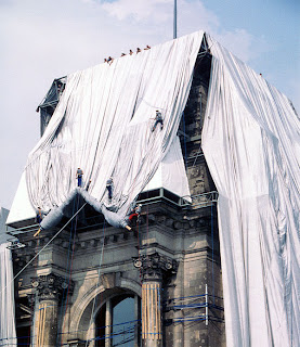
Christo and Jeanne-Claude: Wrapped Reichstag


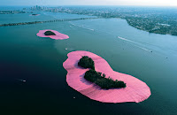
As I have been studying architecture, I have been researching many different architects. While this has been interesting, I thought it could also be exciting to take a new approach to the title, and look at Christo’s work. Although not an architect per say, Christo’s work wrapping buildings definitely links to the ideas of art and architecture, while taking a new, original approach. With work including the wrapping of the Pont-Neuf Bridge in Paris, the 24-mile-long Running Fence in California, The Gates in New York City’s Central Park, and Surrounded Islands in Miami, Christo is highly accomplished. His piece most relating to architecture though is the Wrapped Reichstag in Berlin, and I find this project one of his best.

The Gates 
Surrounded Islands
Pont Neuf Bridge
Running Fence


The Reichstag building is one of Berlin’s most historical landmarks. Opened in 1894, it housed the German Reichstag until 1933, when a fire severely damaged the building. During Germany’s separation, East Germany’s parliament met in the Palace of the Republic, while West Germany’s parliament met in the Bundeshaus in Bonn, and so the Reichstag continued to be neglected. It was not until the reunification of Germany in October 1990, that the Reichstag building underwent construction, and once again became the seat of the German parliament. 


Christo and his wife, Jeanne-Claude, pressed to wrap the building from 1971, after receiving a postcard proposing the idea from Berlin historian, Michael Cullen. It was only in 1994 that a close vote in parliament finally gave them permission to wrap the building. The wrapping began June 17th, 1995, and was completed by June 24th. The piece remained wrapped on display until July 7th. 


Although only on display for a brief two weeks, this art transformed one of Germany’s most important national symbols. By wrapping the Reichstag, the intricate details of the structures were hidden, and the overall shape was left behind. The silver material highlights the features and proportions of the imposing structure, revealing the essence of the Reichstag building. Once wrapped, the building takes on a new identity, as the imposing and solid structure becomes airy and nomadic. One of my favourite, and certainly one of his best-known pieces, the Wrapped Reichstag by Christo is an incredible piece of art, cultural event and political happening, all in one.


Friday, 20 January 2012

Paul McCarthy: The King, The Island, The Train, The House, The Ship

Last weekend, I visited the Hauser & Wirth gallery in Piccadilly, where sculptures and installations by Los Angeles-based artist, Paul McCarthy, were on exhibition. McCarthy's videos, sculptures and performance works throughout his career are known for pushing the boundaries of acceptability, testing the emotional limits of both the artist and the viewer. McCarthy never does anything under-the-top, whether painting with his penis in 1974 or inserting a Barbie doll into his rectum in his piece “Class Fool” in 1976. Yet it was still shocking when I walked into the South gallery of Hauser & Wirth on Saville Row to see his piece entitled, “Train, Mechanical”.

“Train, Mechanical” shows two pot-bellied caricatures of George W. Bush, sodomising two pigs. Repulsive and yet somehow tempting, the work invites you closer to inspect every detail and mechanism. Once there, the viewer becomes conductor, as George Bush’s oversized head and his beady eyes follow the viewer around the space. Squeals from the pigs and the motorised wheeze of pistons accompany the sculpture, making you feel even more uneasy as you view the piece (if that were even possible). To be perfectly honest, I wasn't sure whether to laugh or cry at the spectacle, but I can tell you I was definitely disturbed!

In the North Gallery of Saville Road, viewers climb up ladders to survey
Pig Island”, a work that took McCarthy seven years to complete. “Pig Island” blurs the boundaries between a work piece and the workplace. Constructed on blocks of polystyrene, the island is littered with wood, ruined casts, leftover art materials, shelving units, spray paint and rotting fast-food containers, and is surrounded by a sea of blue carpeting. The island is populated by political and popular figures, by the likes of Angelina Jolie, George W. Bush and the artist himself, all in the centre of a wild and reckless abandon. Its state of chaos and its unfinished nature makes it seem like it could expand into infinity. 

After speaking to one of the men working at the gallery, I learned that through “Pig Island”, McCarthy wanted to convey the deformity and corruption at the heart of the American family. Unlike the picture-perfect Disney fairy tales McCarthy so often references, ‘Pig Island’ flaunts its unfinished state and mechanisms, critiquing the underbelly of the American dream.

Wednesday, 18 January 2012

Picasso’s African Period (1906-1909)

As the French empire was expanding into Africa, African artefacts were being brought back to Parisian museums. This aroused curiosity in African carvings and masks. Naturally, African culture and art influenced some of Picasso’s pieces in this time.

Picasso famously incorporated African influences into his work in Les Demoiselles d'Avignon (1907)


The figures on the right of this painting are inspired by African masks, with their striped and oval forms. His harsh geometric lines have mask-like qualities. Picasso painted their faces with earth tones, typical of African sculpture. The contrast between the femininity on the one hand and the African masks on the other hand is shocking, and exaggerates the mask-like faces further.

Some of Picasso’s other pieces inspired by African masks include:

Head of a Woman (1907)
Bust of a Woman (1909)
Nude with Raised Arms (1907)
Three Women (1908)
As a lot of Picasso’s work was influenced by African art, particularly masks, I thought it would be interesting to make a mask inspired by Picasso’s work in response:

 
Bust of a Woman with a Hat (1962)

I paper-mached my mask using coloured tissue paper and part of a cardboard box I found in someone's recycling on the way back from the art shop (fate!). I then decorated using markers and glitter glue. 


Sunday, 15 January 2012

Leonardo da Vinci: Painter at the Court of Milan


Unquestionably the most anticipated exhibition of the year, ‘Leonardo da Vinci: Painter at the Court of Milan’ has completely sold out of advance tickets and is nearly impossible to get a ticket to: some art lovers lining up for the tickets from before dawn, others paying a fortune to scalpers. Fortunately for me, one of my best friends managed to secure five tickets, and invited me along with her. Her mother paid a student at my school to line up for the tickets from 6am, and that money will go towards the same student’s plan to build a school in Africa this summer- truly an inspirational project.

‘Leonardo da Vinci: Painter at the Court of Milan’ is the most complete display of da Vinci’s paintings ever held. The exhibition brings together about half of the surviving 15 or so paintings by da Vinci and features many more drawings by the legendary artist. The paintings include his acknowledged masterpiece The Lady with an Ermine and two versions of The Virgin of the Rocks, hanging together for the first time. The Portrait of a Musician, La Belle Ferronniere and Salvator Mundi (only recently authenticated as Da Vinci) are also featured. The exhibition focuses on the work da Vinci produced in his formative years as court painter to Duke Lodovico Sforza in Milan in the late 1480s and 1490s.

I really enjoyed this exhibition. It was arranged and presented thoughtfully, as we are able to see da Vinci’s preparatory sketches leading up to each of his paintings, and so get an insight into how each painting came about and the thoughts Leonardo had in creating each. The sketches, tiny in size, ask to be minutely examined, and reveal details in them which we don't normally recognise without such attention.  Da Vinci’s final paintings are equally breath taking, if not more. Through his portraits, da Vinci manages to convey people with emotions and senses, possibly for the first time in art history. The Portrait of a Musician, for example, is able to get across a story and a character. Though many of his works are unfinished (he seemed to always be beginning new projects), his style and the quality of his art influenced generations of artists, and remain to be why he is internationally considered one of the best artists of all time.

What was most amazing for me was to see the two versions of The Virgin of the Rocks side by side. This is the first time they have ever been displayed together and not even the artist himself had this experience. Although this display style makes it possible to compare da Vinci’s different approach to the same subject and see his development as an artist, it could have been more impacting had the paintings actually been placed next to each other, as opposed to on opposite sides of the room, as I found myself flipping my head to look at each, and never got the real effect of comparison I would have loved.

The show’s one major flaw was the unnecessary inclusion of the paintings and drawings by Leonardo’s assistants and followers, including Marco d’Oggiono and Giovanni Antonio Boltraffio. I found that these were distracting additions to the show, which would have been more magical without them. Saying that, this show is a must see. Is the one- hour queue worth it? Definitely. 
The Virgin of the Rocks- Louvre version
The Virgin of the Rocks- London version
       

Saturday, 14 January 2012

Facepaint

I spent the morning experimenting with face paints. I thought the bright colours and tribal-style pattern complemented nature and the flowers, so took a few photos outside, before taking some in front of a white background, to focus on the actual facepaint rather than the composition of the photograph as a whole. Tell me what you think:


Thursday, 12 January 2012

George Condo exhibition at the Hayward

I paid a visit to the George Condo exhibition at the Hayward Gallery last Sunday, the day it closed. On display were paintings and sculptures from the last 28 years of Condo’s career.

When you walk up the stairs into the exhibition, you are greeted with a collection of golden busts. These busts make three-dimensional the twisted characters appearing in Condo’s famous paintings, and introduce the visitor to what lies ahead in the exhibition.

My favorite bust of the exhibition, though not a part of the collection of golden busts I mentioned, was “The Lunatic”.


This bust manages to blend comedy and tragedy, beauty and ugliness. Its complicated texture and shadows add to the lunacy of the sculpture.

After the golden busts, at the very end of the corridor wait nine portraits of the Queen, entitled “Dreams and Nightmares of the Queen”. This controversial piece mutates the Queen, shrinking her head, removing an eye or distorting her nose. Although some critics may be enraged by Condo’s deformation of the Queen, in my opinion, these portraits are good-natured and just poking fun. For Condo, no one, from a Priest to the Virgin Mary to the Queen, is out of bounds, and perhaps his deformation of important figures is an act of social leveling.


Further on, a massive wall in the exhibition is covered from floor to ceiling with Condo’s portraits.


Condo takes imaginary cartoon characters and gives them the gravitas of old master’s portraits. This display style contrasts Condo’s work to traditional portraits, highlighting the absurdity of his paintings. As well as this, it also picks up on his inspiration from and his references to some of the old masters, as his unique and imaginative approach combines something of Picasso, De Kooning, Goya and Francis Bacon in the style of Mickey Mouse. Condo’s references to Picasso become most evident not only in his piece “Memories of Picasso”, but also in “Spanish Head Composition”. Personally, I feel that in these two paintings, his reference to Picasso might be too strong, as he is forcing his work to be compared directly with Picasso’s, and his pieces do not compare. Instead, I prefer the portraits which stick to Condo’s own style and his original imagination. For example, one of my favorite portraits on display was “Red Antipodular Portrait”, featuring a despairing, hairy cartoon character.


Another room featured what Condo named “expanding canvases”. Appropriately named, these pieces appear to expand from a center point and seem like they could go on forever, only confined by the size of the canvas. These pieces are
some of my favorite. As you can see in the piece “Internal Space”, the overlapping shapes make for confusion and chaos from afar, yet from up-close, we can decipher the different forms making up the paintings.


Overall, I thought the Condo show was  a good one. Through the chaos and humor of his paintings, Condo manages to portray the emotion of his subject: their mental state. The exhibition certainly left me smiling on a cold London afternoon.


Wednesday, 11 January 2012

A Dangerous Method

Last night I went to Soho hotel for the London premiere of “A dangerous method” starring Kiera Knightley, Michael Fassbender, and Voggo Mortensen. No red carpet or photographers, it was a low-key event, but the Soho hotel’s private screening room was a cool and comfortable venue. We arrived to the premiere slightly late, so we only just managed to get in for the opening credits.
The film accounts the personal and professional relationships between Dr. Carl Jung with both his patient/lover, Sabina Spielrein and colleague/mentor Sigmund Freud. The film boasts strong performances across the board. Knightley’s portrayal of the unpredictable and mad Sabina Spielrein effectively grips the attention of the audience, conveying her deranged state and sense of panic very well, though at times it is slightly over the top. Fassbender’s portrayal of Dr. Jung and Viggo Mortensen’s portrayal of Freud are both excellent. The complex relationship between the characters is interesting to watch, however I always wanted to see more of it. Through the performances of both men, the audience is able to feel Jung and Freud’s interest in one another, as well as their rivalry. Disappointingly, their disagreements regarding psychoanalysis were only touched upon, and never fully explained, leaving me slightly dissatisfied at the end.
Overall, I would say it’s worth checking out for the sterling performances, but you shouldn’t expect too much from the plot. The movie seems to always be on the verge of something important, but never fully takes off.
Soho Hotel's Private screening room